

“Work smarter not harder” should be your mantra as a developer to prevent yourself from building the same thing twice. Canvas app components can help you accomplish this by building something once that can be placed in several screens or even several applications with the ability to adapt and customize as you see fit.
In this article, I will show you how to make a Power Apps fly out navigation menu component with a simple design and making use of the timer control to add some animation.
Introduction: The Portal App
Imagine the portal app is used by employees at a company to access information regarding trainings, company benefits, time sheets, etc. Employees navigate to different screens by clicking on an option from the navigation menu.
Creating the Component and Properties
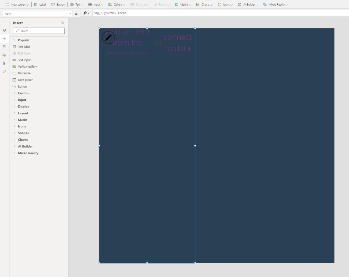
Go to PowerApps Studio and create a new component library if you don’t have one. Open the component library and create a new component called cmp_FlyOutNav.
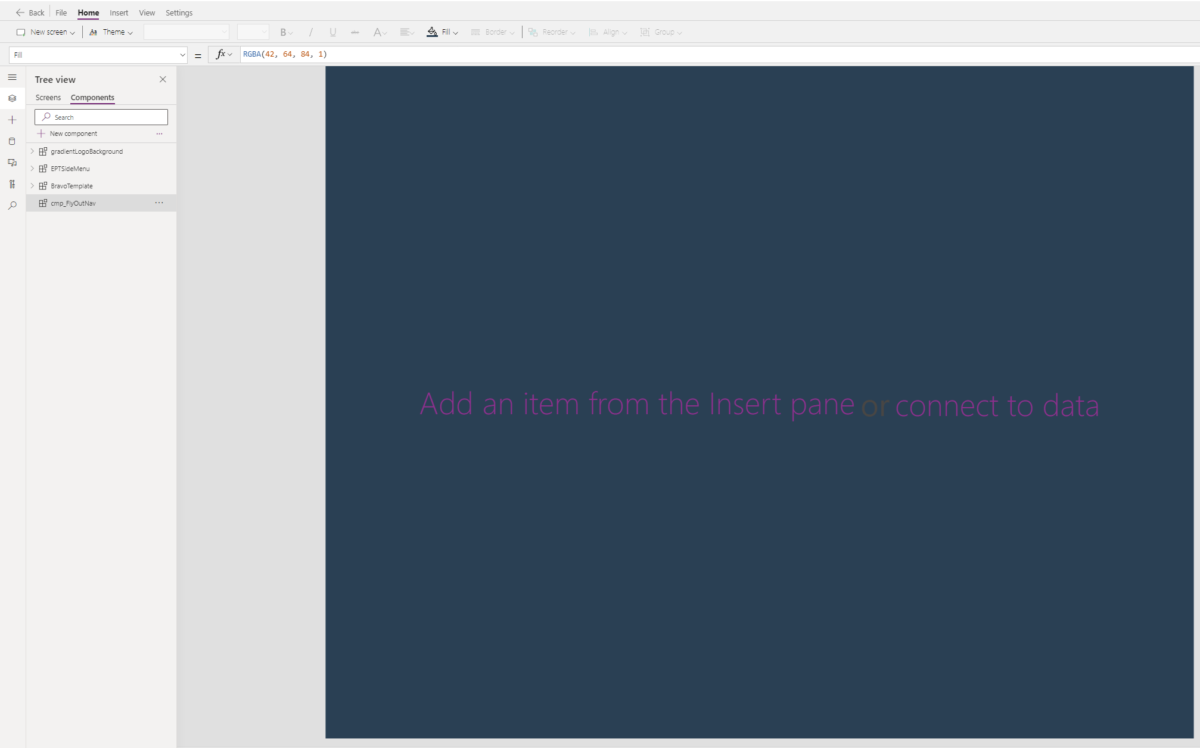
Set the Fill property of the component to a dark blue color using the RGBA value below.
Then make a new custom input property called Items with the data type Table.
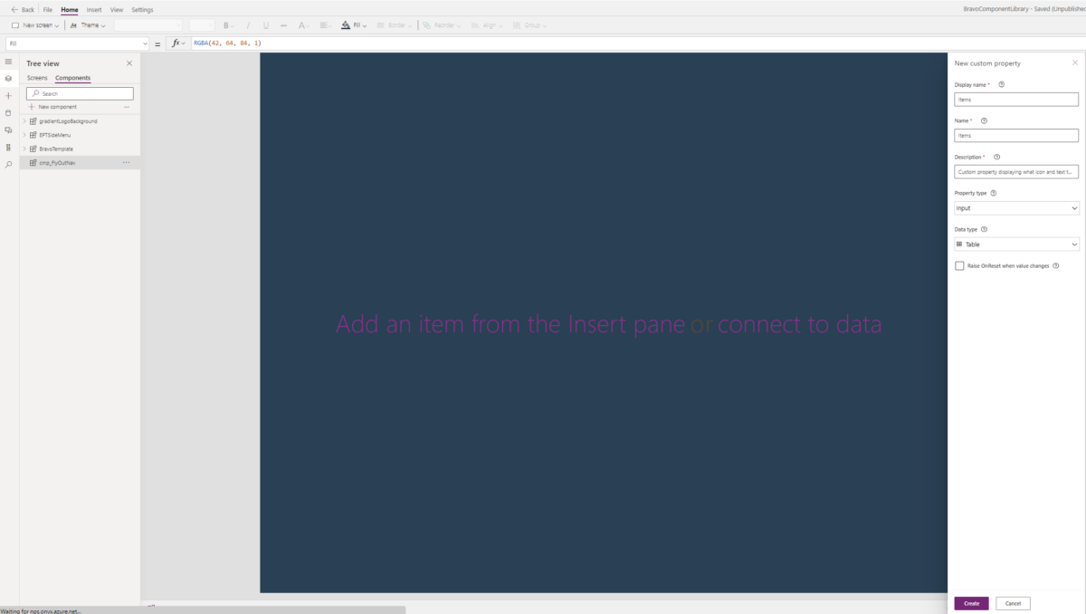
The Table property will hold information about what icon and text to display in the menu and which screen to navigate to on select. Click create then select the custom property to update the table in the formula bar. Use this code in the Table property so we have some values to help visualize while we design the menu.
Table(
{Value: “Item 1”, Icon: Icon.Waypoint, Screen: App.ActiveScreen},
{Value: “Item 2”, Icon: Icon.Waypoint, Screen: App.ActiveScreen},
{Value: “Item 3”, Icon: Icon.Waypoint, Screen: App.ActiveScreen},
{Value: “Item 4”, Icon: Icon.Waypoint, Screen: App.ActiveScreen},
{Value: “Item 5”, Icon: Icon.Waypoint, Screen: App.ActiveScreen},
{Value: “Item 6”, Icon: Icon.Waypoint, Screen: App.ActiveScreen}
)
Now create four additional custom input properties to store the menu colors.
- Color
- CurrentIndicatorColor
- HoverFill
- SelectedFill
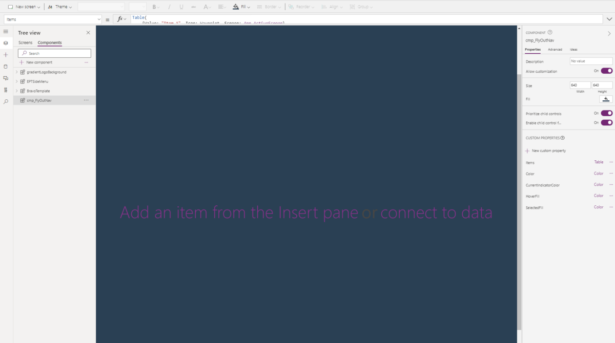
Put these values into the component properties.
Name | Value |
Color | RGBA(179, 190, 196, 1) |
CurrentIndicatorColor | RGBA(1, 149, 135, 1) |
HoverFill | RGBA(255, 255, 255, 10%) |
SelectedFill | RGBA(255, 255, 255, 10%) |
Time to Add Icons in Text
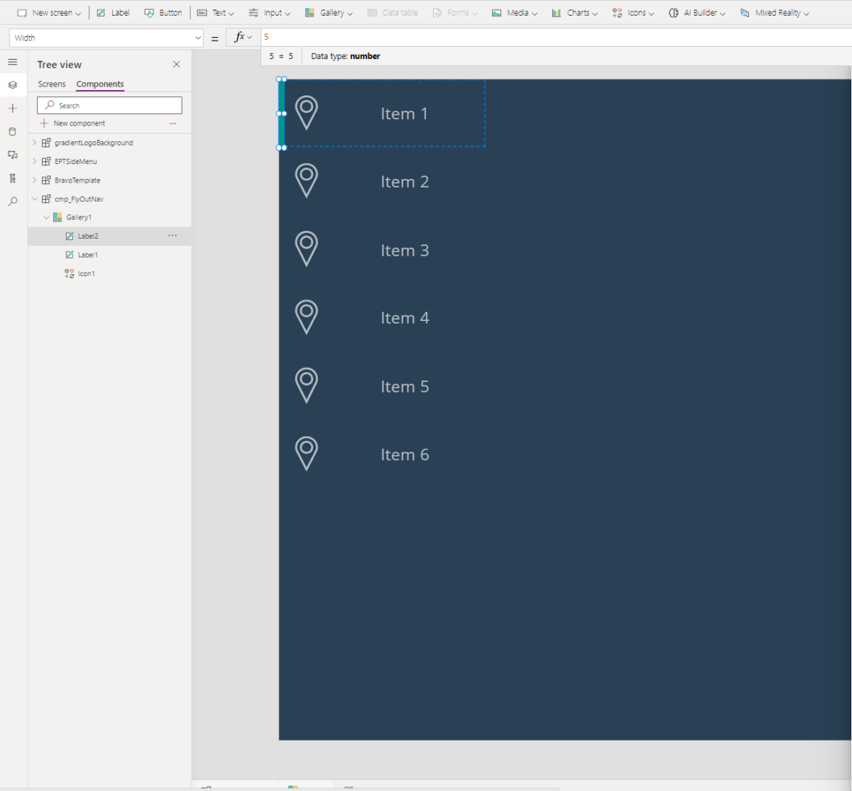
The fly out menu will use a gallery to display the icons and text describing the menu options, so insert a blank, vertical gallery into your component.
Populate the Items property of the gallery using this code:
cmp_FlyOutNav.Items
Populate the OnSelect property to navigate the user to the selected screen with this code:
Navigate(ThisItem.Screen)
Then fill in these remaining properties:
Height: Parent.Height
Width: 200
ShowScrollbar: false
TemplateHeight: Parent.Height/8.5
TemplatePadding: 0
Now insert an icon into the gallery.
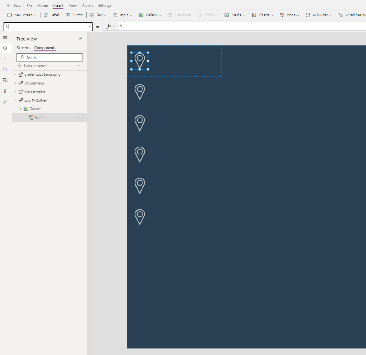
Add the following properties and values to the icons:
Color: cmp_SideNav.Color
Icon: ThisItem.Icon
Height: 35
Width: 35
X: 9
Y: 15
Add a label beside the icon.
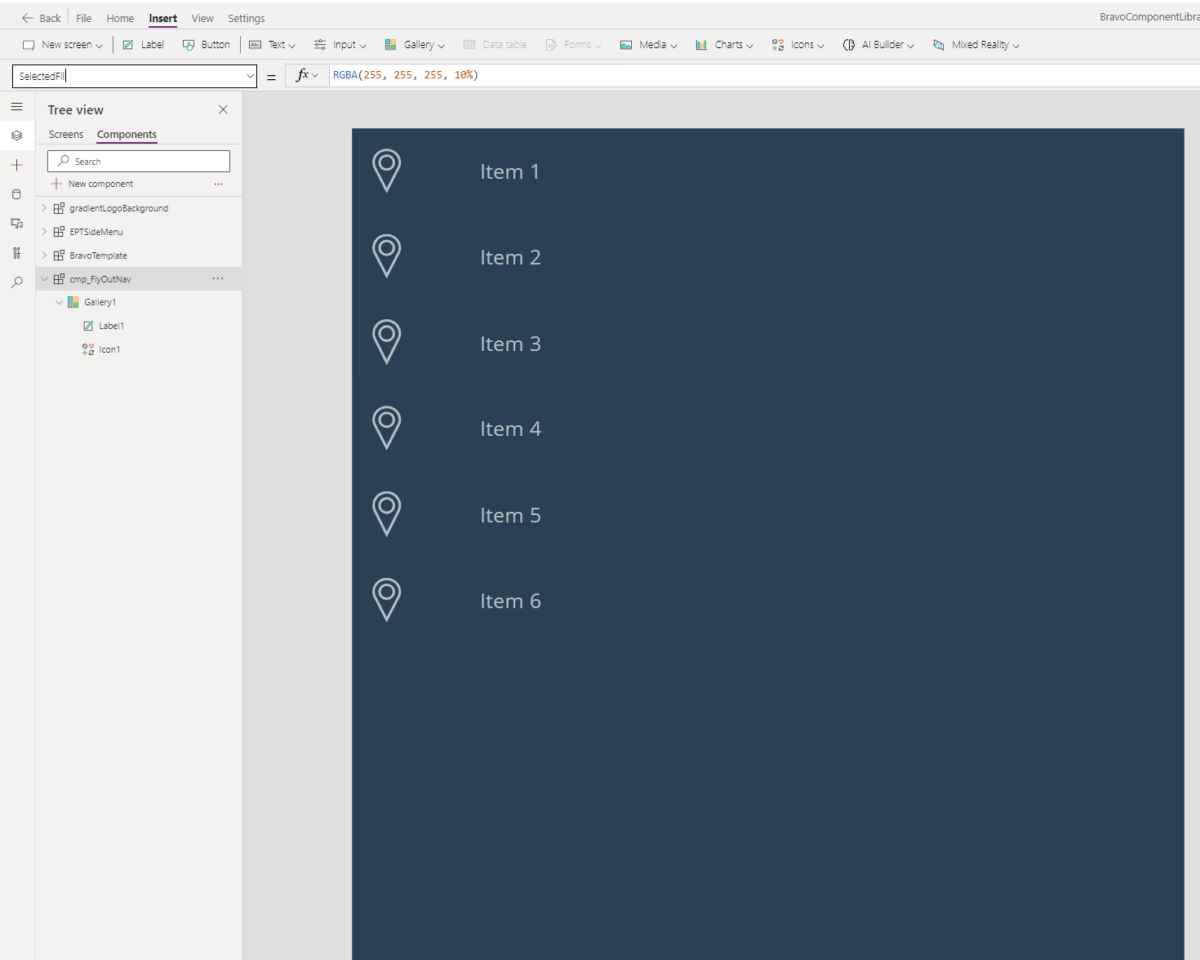
Add the following properties and values to the label:
Color: cmp_FlyOutNav.Color
Text: ThisItem.Value
Size: 12
Width: 156
X: 44
Y: 0
Current Screen Indicator
When a menu item is selected, we want to give the user an indicator beside the current screen by using a thin, vertical rectangle beside the menu option corresponding the current screen.
Add a new custom property called Default with the data type Text.
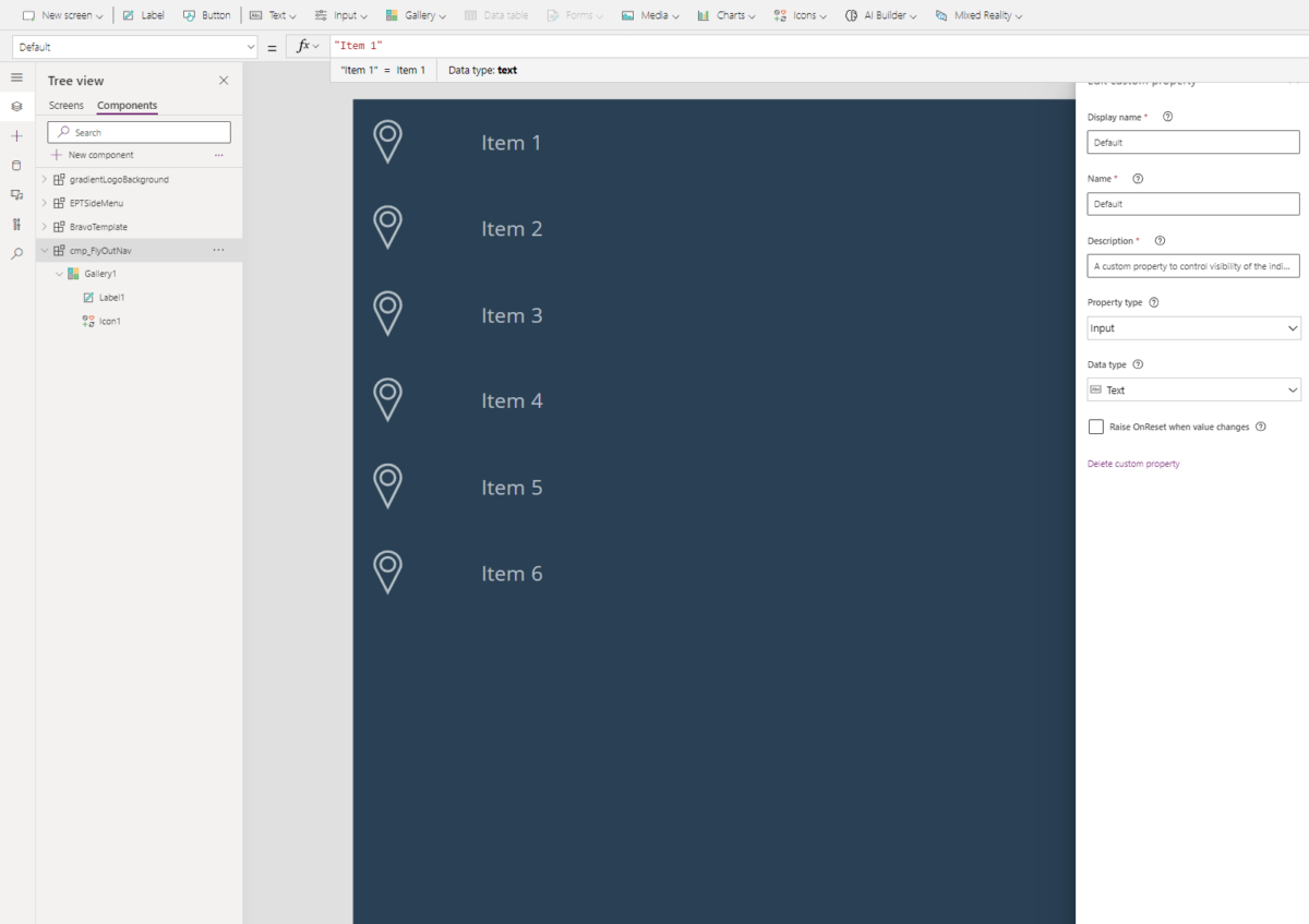
Put the name of the 1st menu option in the Default property so there is a value to build the component.
“Item 1”
Insert a label into the gallery and remove the default text that comes with it.
Add the following values to the properties:
Fill: cmp_SideNav.CurrentIndicatorColor
Height: Parent.TemplateHeight
Visible: ThisItem.Value=cmp_SideNav.Default
Width: 5
HoverFill and SelectedFill
We want to give the user an additional indicator to let them know when the mouse hovers over or selects a menu item by adding a highlight.
Insert another label into the gallery and remove the default text that comes with it.
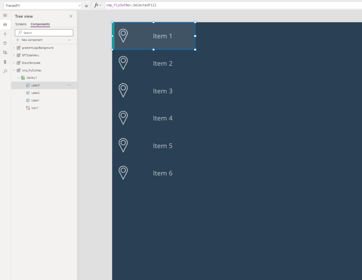
Add these values to the following properties:
Height: Parent.TemplateHeight
Width: Parent.TemplateWidth
Fill: If(ThisItem.Value=cmp_FlyOutNav.Default, cmp_FlyOutNav.SelectedFill, Transparent)
HoverFill: cmp_FlyOutNav.HoverFill
PressedFill: cmp_FlyOutNav.SelectedFill
Add this code to the OnSelect property of the label to navigate the user to the correct screen once clicked:
Navigate(ThisItem.Screen)
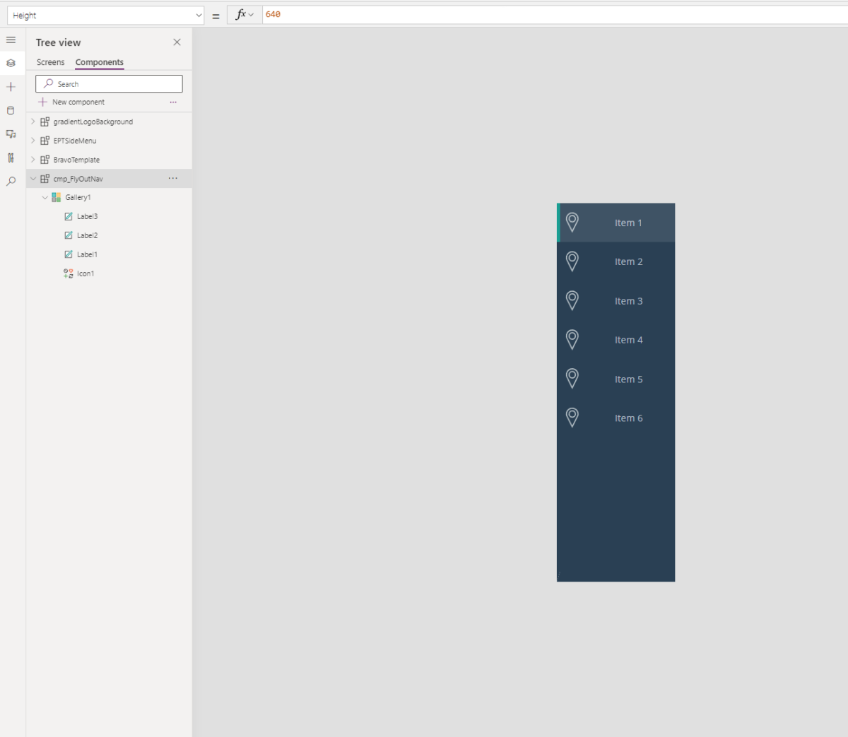
Now, shrink the entire component by changing values to the following properties:
Height: 700
Width: 200
Save and publish your work, and now we are ready to insert the component into an app.
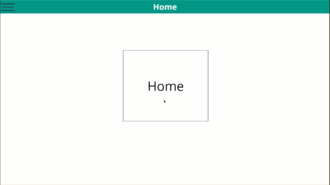
Testing the Component in an App
The purpose of this component is to navigate users to different screens as they select different options. Create these screens in an app to test this component:
- HomeScreen
- TrainingScreen
- TravelScreen
- TimesheetScreen
- SettingsScreen
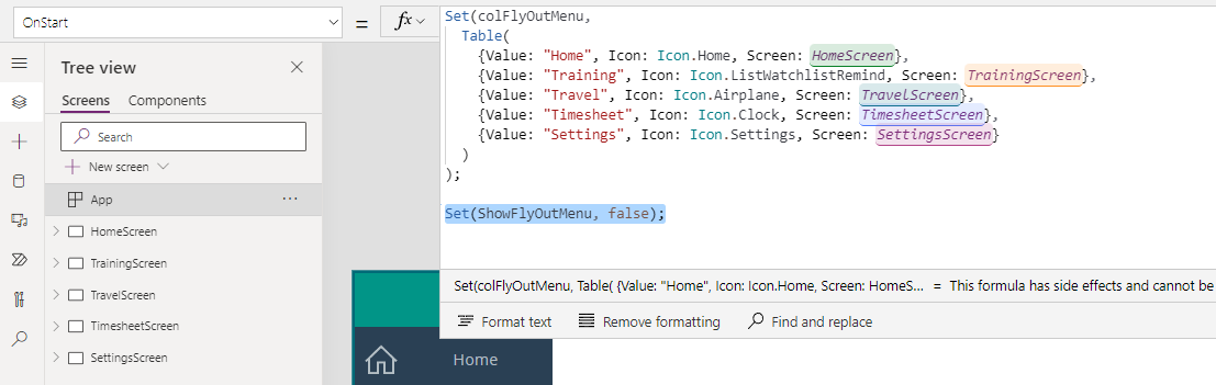
We need to create the menu options as a table inside of a variable instead of a collection, because the menu options are not meant to change while the app is running. Put this code in the OnStart property of the app then run your app:
Set(colFlyOutMenu,
Table(
{Value: “Home”, Icon: Icon.Home, Screen: HomeScreen},
{Value: “Training”, Icon: Icon.ListWatchlistRemind, Screen: TrainingScreen},
{Value: “Travel”, Icon: Icon.Airplane, Screen: TravelScreen},
{Value: “Timesheet”, Icon: Icon.Clock, Screen: TimesheetScreen},
{Value: “Settings”, Icon: Icon.Settings, Screen: SettingsScreen}
)
)
Insert the component into the TravelScreen.
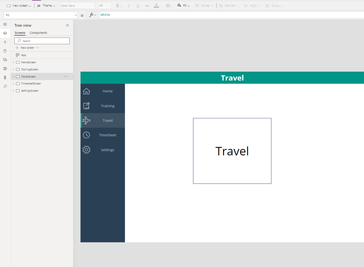
Change the values in the following properties:
Items: colFlyOutMenu
Default: “Travel”
Repeat these steps for the other screens while changing the Items property on the page to colFlyOutMenu and the Default property to the correct page.
You officially have a working menu, but we aren’t finished yet!
Adding Flyout Animation
We are going to add a variable to the app that affects the behavior of the menu. This variable will be set to false when the application starts, and this variable will control the visibility of the component later.
Variable to Control Menu Visibility
Go to the OnStart property of the app again and add another variable:
Set(ShowFlyOutMenu, false)
Timer Control
Insert a Timer Control into the app to help animate the component while it appears and disappears. Users will not see this control, but it will still count time while invisible. Don’t be alarmed by the error that appears. We will resolve that later when we define it in a hamburger menu icon.
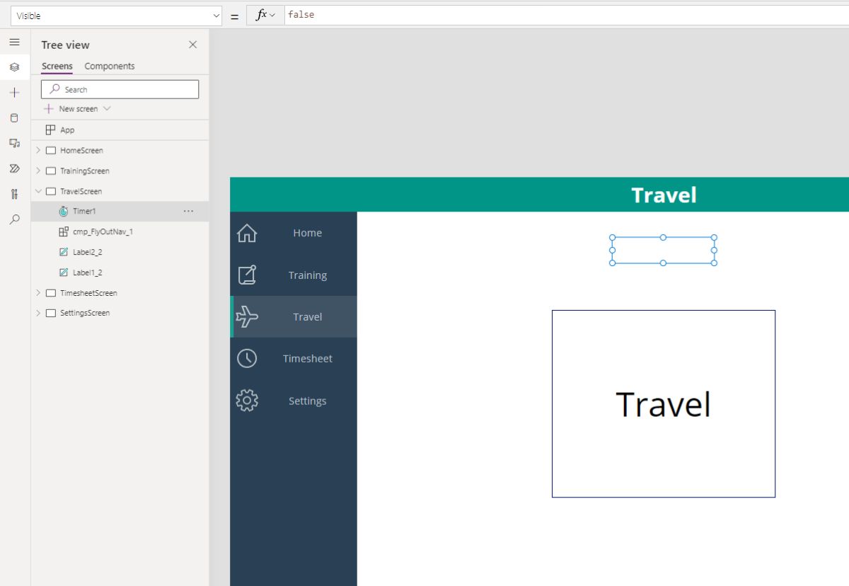
Add the values to the following properties on the Timer control:
Visible: false
Start: StartTimer
Hamburger Menu
Add a hamburger menu icon to the header of Travel screen.
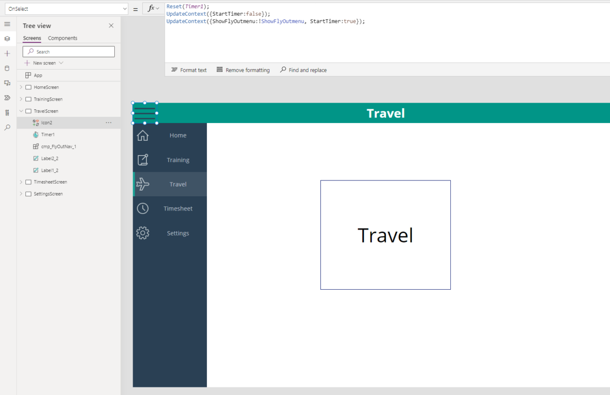
Add the values to the following properties:
OnSelect: Reset(Timer1);
UpdateContext({StartTimer:false});
UpdateContext({ShowFlyOutMenu:!ShowFlyOutMenu, StartTimer:true});
Color: RGBA(42, 64, 84, 1)
Select the menu component and change the Visible property to ShowFlyOutMenu.
Now when you click the hamburger menu, the menu will appear and disappear without animation. You can stop here and complete these steps on all screens in the application starting with hamburger menu steps, or you can continue to add sliding effect for the menu.
To achieve the final piece, you are going to add the formula below to the X property of the menu component on the screen:
If(ShowFlyOutMenu,
-cmp_FlyOutNav_1.Width +cmp_FlyOutNav_1.Width * (Timer1.Value/Timer1.Duration), -cmp_FlyOutNav_1.Width *(Timer1.Value/Timer1.Duration)
)
All controls in the app are placed relative to the X and Y properties on the application, so this piece of code will shift the position of the menu component control off screen while incorporating the timer control for the duration of the shift in position. The menu will shift onto the screen when ShowFlyOutMenu = true and shift back off screen when ShowFlyOutMenu = false.
Important
Once you add the timer control to a screen, the duration of the timer is automatically set to 60,000 milliseconds (60 seconds). You will want to change the Duration property on your timers to something much shorter, or it will seem like the menu is either not working or entirely too slow. We shortened the duration to 1,000 milliseconds for the purpose of this demo.
Finish adding the fly out animation on the remaining screens to complete your menu in your app.
Need help building a proper user interface? Fill out the form below to get in touch with one of our experts!


